Quantcast
Channel: Art & Color – Munsell Color System; Color Matching from Munsell Color Company
Viewing all 45 articles
Browse latest View live

Munsell Color Chroma – 3rd Step in Munsell Color Order System

$
0
0

Albert Munsell again returned to his artist roots to develop the color chroma scale, which refers to the strength (also known as saturation) or weakness of a given color.  The chroma color attribute completes Munsell’s vision of a systematic  means for effectively communicating and teaching color – a system that he modeled after  what he saw as a three-dimensional system of  teaching music, where each sound is comprised of three elements—pitch, intensity and duration.  Having developed the Munsell hue circle, and the neutral value scale, Munsell completed his three dimensional color model with chroma.

Munsell said of his chroma attribute, “Flat diagrams showing hues and values, but omitting to define chromas, are as incomplete as would be a map of Switzerland with the mountains left out or a harbor chart without indications of the depths of the water.”  Color chroma was also the attribute that led to Munsell’s color tree.  Just as the tree branches run perpendicular to the trunk of the tree, so too does the chroma scale.  Color families (color hue) that approach the lightest and darkest parts of the neutral axis are less chromatic or saturated than their mid-value range counterparts. Using the tree metaphor, the “limbs” of less chromatic colors would not extend very far from the neutral axis or “trunk.”

Munsell’s Color Order System Was Built to Last

Munsell’s hue, value and chroma three-dimensional color order system not only made it easier to visualize color, but also the relationship of colors to each other.  This important distinction not only improves color communication, but also enables artists, designers and color technicians to properly harmonize color.

Another important distinction of Munsell’s color system is that it wasn’t limited to the color technology of the time.  The system was inherently designed to accommodate new and more highly pigmented colors as technological innovation occurred.  In fact, Munsell himself said, “It [Munsell Color Order System] includes and arranges all color sensations on a measured foundation, even providing for still stronger colors, should science discover them.”

A System of Color Rooted in Art and Science

So there you have it.  The Munsell Color Order System… where art and science intersect and standing right in the middle is Albert H. Munsell. His life’s work beautifully summarized in his own words:

The possibilities of the system are very great.  It possesses elements of simplicity and attractiveness.  It gives one almost unconsciously power of color discrimination.  It provides on only a rational color nomenclature, but also a system of scientific importance, and of practical value.

Color anarchy is replaced by systematic color description.

–Professor A.H. Munsell

Learn about the first two steps towards color order, “color wheel charts” and “color value scale.”

References:

Munsell, A.H., ed. 12, 1971. A Color Notation. Baltimore, MD:  Munsell Color Company.


Munsell Color Order System; Why it is the Best

$
0
0

A.H. Munsell thought of everything when he developed the Munsell Color Order System, including the top ten reasons why it works so well.  So Munsell was not only an artist with latent scientist tendencies, but also a good marketer.   Here is what Munsell referred to as his “Applications and Advantages of the Munsell System.”

Top Ten Advantage of the Color Order System from Munsell

  1. Loose and unrelated color terms are replaced by a definite notation.  (like having a street address vs. a PO Box)
  2. New colors in no way disturb the orderly classification, as a place is already awaiting them. (fits today’s colors and tomorrow’s inspirations… sounds like color Heaven!)
  3. Each color names itself by its degree of hue, value and chroma.  (self-service… now that’s progressive!)
  4. Color may be easily and rapidly specified by direct perceptual comparison. (works the way your eyes do)
  5. Each color can be recorded and transmitted by a simple code. (color communication made easy!)
  6. Color contracts can be drawn and proved by psychophysical tests. (satisfies the legal community)
  7. Color tolerances can be readily and meaningfully expressed. (let’s you have a back-up plan.)
  8. Color grading of many agricultural and industrial products can be readily accomplished. (easily used directly in the field!)
  9. Fading can be defined and plotted at certain intervals, showing its progress in quantitative terms.  (like color GPS!)
  10. Specifications may be re-expressed in terms of the C.I.E. or any related system. (plug n’ play!)

Munsell’s color order system was truly ahead of its time!

Learn about Munsell’s 1st, 2nd, and 3rd dimensions of color: the Munsell Color Wheel, the Munsell Color Value Scale and the Munsell Color Chroma Scale.

References:

Munsell, A.H.,  ed. 12, 1971, pg. 65. A Color Notation. Baltimore, MD:  Munsell Color Company.


Teaching Color: Learning the Fundamentals of Color for Education

$
0
0

Perhaps a precursor to today’s Fundamentals of Color course, the “Training of the Color Senses” lecture was held by Albert H. Munsell in 1908 at MIT’s Huntington Hall.  At the lecture, Munsell presented the benefits of his color order system as it related to teaching color.

Early Adopters of the Munsell Color Order System for Art Education

Officially launched in 1905 the Munsell color order system had been in use for three years as an educational tool by art educators from a wide geographic area.  In his diary, Munsell refers to the early adopters of his color order system as “leading directors and supervisors of art education.” Some  of these early adopters included  Arthur Dow of the Teachers’ College and James Hall of the Ethical Culture School in New York,  Miss Haven of the Kindergarten Institute in Chicago, J. Frederick Hopkins of the Maryland Institute in Baltimore, and R.B. Farnum of the Cleveland Art School, who was a 1906 graduate of Munsell’s alma mater, Massachusetts Normal Art School.

A.H. Munsell to Art & Color Educators . . . “you’re doing it wrong.”

Just as Munsell’s color order system is today, back in 1908, Munsell emphasized that his color order system for teaching color was free from personal bias.  He explained how his color system was based on what back in 1908 was “the latest knowledge of the action of the eye.”  Using the training of the other senses as an example, Munsell described “tempered degrees” as opposed to training using extremes.    So for example, he focuses on harmonious middle colors of red, blue, green etc. found on the color wheel and in the Munsell Color hue circle.

Munsell even went so far as to criticize the then methods of teaching color using primary colors red, yellow and blue.  Instead, the Munsell Color Order System emphasized that red, green and yellow are the “true basis” for teaching color because of the way the retina works.  According to Munsell the correct complementary colors are “red and blue-green,”  ”green and purple,” and “violet-blue and yellow”—very similar to the hue circle. Munsell then went on to describe the three dimensions of color—hue, value and chroma, and according to his diary, those who attended the lecture remained to ask questions.  The Munsell Color Order System was taking hold.

Get a crash course in Munsell Color notation, including how A.H. Munsell developed his color order system to mimic the way the human eye sees color.

References:

A. H. Munsell Color Diary, 1908-1918, Volume B Part 1, pp 242-243. Courtesy of Rochester Institute of Technology, Munsell Color Science Laboratory.

Color Research . . . the Art and Science of the Munsell Color Order System

$
0
0

It was the early 1900′s and A.H. Munsell was fully immersed in scientific research on color in preparation for his upcoming book A Color Notation. While his impetus for developing the Munsell Color Order System was rooted in education—a logical, easily visualized method to teach color theory—the basis for Munsell’s work was indeed scientific.

A.H. Munsell’s Research on Color Leads to Photometer Patent

In 1901, A.H. Munsell patented a photometer, which proved to be important in developing the color order system.  He consulted with several leading scientists, including American physicist, Ogden Rood who was influential in Munsell’s work on the photometer along with other science luminaries.  Munsell’s color theory leaves no stone unturned.  He researched the relationship of Hue, Value and Chroma, and early on in color science, began to explore the relationship between light source and color.  The light source/color relationship was made clear at an October 28, 1902 meeting in New York at the Edison Light Company, where several papers were presented suggesting that “Imitation of daylight – and means of measuring other light in terms of daylight—imperative for color comparisons,” hence today’s standards requiring daylight for accurate color evaluation.  According to Munsell’s diary, after spending his morning immersed in the latest scientific color research, Munsell, the consummate artist, spent his afternoon at New York’s Metropolitan Museum of Art “studying old masters.”

Over the next several months, Munsell visited with colleagues to test his photometer and the results were positive.  Not only was the photometer deemed accurate but also practical. His colleagues saw the practicality of a device that could overcome the limitations of the human eye.  One of his colleagues suggested that the photometer’s commercial use be piloted at the New York Navy Yard for testing signal glass.  Specifically, it would be use to check for color blindness.

From Photometer to Color Top to Color Order System

At the same time Munsell was working on what would become the disc colorimeter—a series of colored discs that when rotated create color.  Munsell referred to it in his early work (circa 1902) as a “color top.” The discs were tested to show the relationship between chroma (color intensity) and value (lightness or darkness) for any hue.  Munsell was attempting to create a set of templates that would describe the combination of chroma and value or any hue.  Munsell established the value scale of ten equal steps from white down to black.  Munsell took the strongest (high chroma) red and reduced it to white, black and gray.  His color experiments showed that equal loss of chroma requires unequal steps of value and unequal steps of chroma permit equal steps of value.  In other words, in order to maintain an equal value scale, the chroma of the red hue would have to be adjusted in unequal steps as chroma was reduced from highly saturated red to white and equally as chroma was stepped from highly saturated red to black.

The exercise of developing the color templates was important to Munsell color theory in that he was uncovering the sensitivities of the human visual system to certain colors.  It explains why colors of a certain value (lightness) in a Munsell Book of Color do not go beyond a certain chroma—it’s not physiologically possible.  Munsell points out in his diary that the exercise was “very fatiguing.”  He painstakingly set up the experiment, viewed and graphed each color.

Though the color top was developed for art education purposes, Munsell’s journey to develop the photometer and color top, was grounded in early color science principles.  Throughout his color research process, he applied these principles to determine the hue, value and chroma scales for his upcoming Color Atlas.  Learn more about how the Munsell Color Order System works in real life applications.

References:

A. H. Munsell Color Diary, 1908-1918, Volume A Part 5 and Volume A Part 6.  Courtesy of Rochester Institute of Technology, Munsell Color Science Laboratory.

Munsell Color in Books

$
0
0

In the vast world of color there are quite a few color books that reference Munsell Color. By “quite a few” we mean there are more than we can count. Here are just a few that mention Munsell. Crossing over into many different industries, Munsell Color appears in books on a number of subjects. These subjects include art, architecture, design science, archaeology, food and so many other topics.

Color Theory Books

Color for the Real World: A Complete Color Course by Alice Chu & Jen Nemeth

This color theory book explains the principles in a visual language, applicable to all color design disciplines. “Color for the Real World is an all-in-one textbook containing a lab manual and an eResouce for students of design, including fashion design, interior design, communication design, textile design, product design, and illustration.”

The New Munsell Student Color Set by Jim Long & Joy Turner Luke

This book about color is written by James Thomas, “an architect, artist, lighting designer, State Board certified Interior Designer, Professor Emeritus in the departments of Photography and Film and Interior Design, and retired chair of Photography and Film at Virginia Commonwealth University.” This color book is co-authored by Joy Turner Luke who “is a painter and owner of Studio 231 in Sperryville, Virginia, where she conducts intensive courses on color and artists paints. She also lectures widely on these topics for art schools and other groups with a specialized interest in color.”

Measuring Colour by Robert Hunt

Called “the classic authority on colour measurement,” this color book demonstrates “major importance in many commercial applications, such as the textile, paint, and foodstuff industries; as well as having a significant role in the lighting, paper, printing, cosmetic, plastics, glass, chemical, photographic, television, transport, and communication industries.”

Color + Space: Transforming Interior Space by Ronald L. Reed

This color theory book “presents color theory in terms of design principles such as balance, rhythm, emphasis, proportion, unity, and variety. The text is infused with insights into how people perceive color, and helps the young interior designer focus on the user experience of a space.”

Individuality in Clothing Selection and Personal Appearance by Hazel Jackson et al.

individuality in clothing selection and personal appearance book cover

The authors of this color book “present a broad base of knowledge at an introductory level for readers’ general education—unlike other books, which focus more narrowly on the needs of fashion professionals. Packed with activities, learning objectives, illustrations, and photographs, this user-friendly book meets the needs of future fashion professionals.”

Sensory Evaluation of Food: Principles and Practices by Harry T. Lawless & Hildegarde Heymann

“This text is designed for undergraduate and graduate courses in sensory evaluation and as a reference for industrial practitioners. It covers all the basic techniques of sensory testing, from simple discrimination tests to home use placements for consumers.”

Color Design Books

Color Drawing: Design Drawing Skills and Techniques for Architects by Michael E. Doyle

This color design book by Michael E. Doyle “is the ultimate up-to-date resource for professionals and students who need to develop and communicate design ideas with clear, attractive, impressive color drawings. In an easy to use, step-by-step approach, this comprehensive guide presents a total system of color design drawing that encompasses approaches to sketch communication as well as more finished presentation drawing.”

Color Image Processing and Applications by Konstantinos N. Plataniotis, Anastasios

One review of this color book says that most image processing and computer vision textbooks tend to leave out color image processing or do not go in depth. “…this book fills the need in this important area quite nicely. The authors are recognized experts in the area, particularly in color image filtering.”

Designer’s Guide to Fashion Apparel by Evelyn L. Brannon

This color design book from the world of fashion “explores the creative process of apparel design and the development of a collection. From budget to couture, children’s to men’s and women’s, fashion-forward to traditional and formal to active, the text demonstrates the proper application of design principles in creating aesthetically-pleasing apparel…”

Light: The Shape of Space: Designing with Space and Light by Lou Michel

This book by Lou Michel touches on “color theory for space and light.”

Color Ordered: A Survey of Color Order Systems from Antiquity to the Present by Rolf G. Kuehni & Andreas Schwarz

This color book could be considered a history of color. “Color Ordered is a comprehensive, in-depth compendium of over 170 systems, dating from antiquity to the present.”

Mastering Photographic Composition, Creativity, and Personal Style by Alain Briot

The topics covered here include:

  • How to compose with color, with black and white, and with light
  • How the elements of color-hue, contrast, and saturation-work in your images
  • How to define a color palette for a specific photograph

Science Color Books

Discovering Physical Geography by Alan Arbogast

“…provides a comprehensive suite of animations, simulations and interactivities that help readers comprehend important Earth processes.  Vivid images, animations, videos, simulations, assessments and virtual field trips all support the narrative material and enable readers to interact with key processes and actively participate in visualizations.”

The Science of Color by Steven K. Shevell

“Focusing on the principles and observations that are foundations of modern color science and written for a general scientific audience, this book broadly covers essential topics in the interdisciplinary field of colour, drawing from physics, physiology and psychology.”

Practical Handbook for Wetland Identification and Delineation by John Grimson Lyon

“… defines wetlands, describes their functions, and presents a variety of methods used to assess the extent of wetlands.” Lyon’s handbook draws upon the Munsell Soil Color Charts.

Color Psychology

Atkinson & Hilgard’s Introduction to Psychology, 15th edition by Nolen-Hoeksema, Fredrickson, Loftus and Wagenaar

This textbook touches on the psychology of color while providing a “thorough understanding of the classic landmark studies which have shaped psychology as an academic discipline.”

Hospitality Design for the Graying Generation: Meeting the Needs of a Growing Market by Alfred H. Baucom

Inside of this guide, you will find “extensive coverage of the specific physical needs and psychology of seniors, including physical strength, hearing, sight, color preferences, and other areas.”

A Favorite Munsell Color Book

Obviously we were not able to include every book that references Munsell Color, so tell us about the ones we missed! What is your favorite book that references Munsell Color?

Albert H. Munsell the Artist

$
0
0

Although best known for his Munsell Color System, Albert H. Munsell was first an artist, although little is known about his art.  Munsell was in his early 20′s when the Impressionism art movement was in full swing (1870′s to 1880′s).  In fact, from 1885 until 1888, Munsell studied art at École des Beaux Arts, across from the Louvre in Paris—the heart of the Impressionist movement.   While studying in Paris he won several awards for his work in anatomy, perspective and composition. Though likely influenced by the Impressionist movement, Munsell was known for his seascapes.

crashing waves on rocks painting on wood panel

Crashing waves on rocks; Painting on wood panel, 1893 Image Courtesy of Artnet.com

Impressionist Art Movement:  Munsell Shares His Color Order System

In the late 1880′s Munsell shared his ideas on the Munsell Color System with peer and colleague Denman Ross, Harvard professor of art theory and history—and not a fan of impressionism, but instead preferred the palettes of the Rennaissance movement.  Both Ross and Munsell were seeking a systematic means for describing visual perception of color.  They studied scientific theories on color including the popular Modern Chromatics, published by physicist Ogden Rood in 1879.

According to Munsell’s diaries, the two discussed Munsell’s color theory while on sketching excursions.  On one excursion Munsell described his painting, “Chloris Calls,” where he arranged what he referred to as a “spectrum circuit on the rim of a circle” (perhaps a primitive version of his color sphere).

deman ross, tones charted in the shape of a spiral

Denman Ross, “Tones Charted in the Shape of a Spiral,” 1898. Ross Papers, Folio Box 42, Harvard Art Museum Archives. This is the spiral diagram used by Munsell. Photo: Katya Kallsen © President and Fellow of Harvard College

Then, while on another sketching excursion—this time along the Grand Canal in Venice, Italy—the two were discussing famed Venetian Renaissance artists, Tintoretto and Veronese when the topic of a “systematic color scheme” for painters came up.  Munsell shared the spirals he used use for his painting “War Cloud,” which was likely a seascape, since it was painted in what’s now known as Smuttynose Island just off the coast of New Hampshire.  One can easily imagine the lively debate that ensued when Ross told Munsell that he doubted the value of Munsell’s color sphere, but thought the photometer a useful device.

oil painting of helen keller by albert h munsell

An oil painting of Helen Keller, by Albert H. Munsell, 1892. Image Courtesy of the American Foundation for the Blind

The Portrait… A Staple in Every Artist’s Repertoire

Portraiture was a popular staple of many artist’s portfolios, and so it was for Albert H. Munsell.  One of his most notable portraits was that of his father-in-law, Alexander E. Orr.  In 1903, Munsell, busy with a wife and children, produced the oil painting of his father-in-law, who was a successful businessman credited with arranging the financing and construction of New York City’s subway system.

alexander e orr oil on canvas by albert h munsell

Alexander E. Orr, Oil on Canvas, 1903 by Albert H. Munsell Image Courtesy of the New York State Museum

By the early 1900′s, Munsell was deeply involved with his work on the color order system.  Much of his studio work was dedicated to drawing color spheres and pursuing color order, despite the advice of his good friend Ross, who shared Munsell’s passion for color order by saying, “A system in which color and values are composed in equal interval of equal contrasts in all directions.  In which one can think infinite things in tone and convey those things to others in accurate terms.”

munsell holding color sphere with children

A.H. Munsell with Children and Color Sphere Photo Courtesy of the Hagley Library and Archives

References:

A. H. Munsell Color Diary, 1899-1918, Volume A Part 1, pp 2-3, Volume A, Part 2, pp 32a. Courtesy of Rochester Institute of Technology, Munsell Color Science Laboratory.

Denman Ross http://en.wikipedia.org/wiki/Denman_Ross

Marie Frank, Denman Ross & American Design Theory (University Press of New England, 2011) pp 96-97.


Munsell: A Multitasking Artist With a Passion for Color Education

$
0
0

In the early 1900s, much of Munsell’s work on color theory was culminating in several business offers to produce his color education kit and photometer.  Despite the business details of selecting a publisher, determining the appropriate selling price and commissions

as well as fielding calls on the technicalities of his photometer, Munsell continued being an artist, remaining true to his artist roots.

Painting Portraits: Munsell & Alexander Orr

It wasn’t uncommon as an artist at the turn of the century to earn a living painting portraits.  (It’s still a source of income for today’s artists.) So during this busy time in Munsell’s life, he also began working on a portrait of Alexander E. Orr*, who was not only a highly respected New York businessman, but also A. H. Munsell’s father-in-law.  According to Munsell’s diary, he started the portrait on February 22, 1905, which he was commissioned to do for the trustees of the South Brooklyn Savings Bank, of which Alexander Orr had been president.  Munsell completed the portrait after 13 sittings in April of 1905 (just seven years after Brooklyn became annexed to New York City).

Color Education . . .  “A Splendid Thing”

During the same period, Munsell’s book, A Color Notation, was nearing publication along with his color education materials, which included the book, wooden spheres to teach Munsell’s three dimensional color order system, color charts, colored pencils and colored crayons.  All materials were meticulously designed and measured to meet the exacting colors established as the basis for Munsell’s Color Order System.  The Munsell color education toolkit included the colors red, yellow, green, blue and purple.  After showing his color education materials to New York City Superintendent, Dr. James P. Haney, Haney remarked, “You have done a splendid thing for teachers who are anxious to understand color.”

Munsell Shifts from Color Education to Color Expert

As if Munsell didn’t have enough on his plate, he was also called to be an expert witness, thanks to his work in developing the photometer.  Munsell was paid $25.00 for his time and to develop tests to determine if an obstruction of light contributed to damage of the Albany building caused by passing L trains.

A multi-tasking Munsell continued to develop and market his color education materials all while practicing his craft and applying his color expertise where needed.  Learn more about Munsell color education tools.

*If the name Alexander Ector Orr sounds familiar, it should.  A. H. Munsell’s son, who later took over the Munsell Color Company following A.H. Munsell’s death in June of 1918, was named Alexander Ector Orr Munsell or A.E.O. Munsell.

References:

A. H. Munsell Color Diary, 1908-1918, Volume A Part 9.  Courtesy of Rochester Institute of Technology, Munsell Color Science Laboratory.

Using Spectral Reflectance to Protect Films from Digital Theft

$
0
0

Thanks to Amir Rastar for this fascinating application of the Munsell Color System. Amir has developed an interesting technique for protecting films from digital theft. Would-be thieves will learn that crime doesn’t pay, but only after they’ve tried to view what’s been illegally recorded.  Learn more…

Improving Color Reproduction from Screen to Print

Spectral reflectance is like a fingerprint for the color of a material. If it is available, the color of the material can be predicted or reproduced. There are several methods in color reproduction such as color appearance models and spectral estimation. In spectral estimation we try to estimate the reflectance of a color material as the key factor for its color.

For example, when you see a color postcard on the Internet and then receive the actual item, there is typically a difference of color between what you saw online and what is delivered to you. Utilizing data such as spectral reflectance helps us to more accurately reproduce the color that is being seen digitally. However, to date, there is no laboratory instrument in people’s home or offices that enables them to accurately depict this color for every variety of monitors. Product photographs are taken and published and there can be a huge difference between what they see and what they get.

Using Munsell Color for Spectral Estimation

To depict color more accurately, it is important to make the color device independent, i.e. to have some standard data like CIExyz instead of RGB values which are limited and independent from the imaging devices. In this case, I characterized a digital camera and found a conversion matrix which can convert the RGB data from the camera to the standard CIE color values. To do this, I use the Munsell color system. I captured photographs of standard Munsell samples and derive a relation between the standard color values of the Munsell samples and the RGB data of their image from the camera. I then use this data to estimate the spectral properties of many test samples. Using Principle Component Analysis (PCA) method I also calculated the eigenvectors of the 1269 standard Munsell color chips from their spectral reflectance factors so there can be some basic functions working as a coordinate system for the whole color gamut.

I have utilized this camera characterization technique in order to protect films from digital theft while they are being shown on the screen in theatres. Patrons may attempt to record a film in the theatre using a camcorder. There are many ways to deter this practice, like watermarking and camcorder jamming that may prevent them from doing these illegal acts. I choose to use the difference between the visual systems of the human eye and a camcorder, and the concept of metamerism to make a film which can be seen normally when viewed, but produce a distorted color when it is recorded. I used Munsell colors to characterize my test camera, which helped me to estimate the sensitivities of each color sensor.

It is a wonderful world and it is not without color.

Learn more about Amir’s process in the publication, Color Research & Application: Cinematic-Film Protection Using Metameric Blacks.


Color Website Inspiration Part 2

$
0
0

We continue our series on color websites, websites about color and really cool websites that use color in fascinating ways.  Don’t forget to check out Color Website Inspiration Part 1.

Cool Website with Color and Movement

Using color and movement can be a tricky feat, but Yuna Kim’s website pulls it off.  Specializing in print and digital branding, the site opens with pure blocks of color shapes that revel different projects.  Everything is incredibly clean, very modern and quite simple, yet very effective.

With Clients such as the American Museum of natural History and Other Press under their belt, the same clean design of the website is carried over to the individual projects.

A Cool Color Website in 3D

The website of pop artist Charles Fazzino is both colorful and whimsical, but what really sets it apart from other artist’s sites is the Fazzino 3-D Art Gallery.  This unique interactive virtual gallery was designed by EXHIBBIT and it lets you get up close and personal to the artwork.  You begin by standing in the gallery space, just like you would at a real art show.  Then, you zoom in and out at various angles as if you are moving about the space inspecting the work.

fazzino 3d art gallery

A Color Website with Deep Insights

Marry astrology with color design and you have Colorstrology.  With a similar feel to Color in Motion, this color website opens up with a very calming and colorful flash page that talks about color and its effects on humans.  Based on the idea that each of us has a certain color that reflects upon our inner most self, the color website then allows one to find their color based on their birthday. Even if you don’t believe in such things like fate and a dynastic allegiance to a certain color, some of the personality insights can be quite eye opening.

colorstrology website

A Beer Website with Great Color Design: Not Caramel!

The use of color as a branding tool has been a foundation of advertising since the very earliest of days.  Expanding that branding from product deign to print to interactive medium is essential. Austin Beer Works has this down pat. Bright, clean, easy to navigate and fun, the main branding colors are further broken down to represent each beer.  Yes, the requisite caramel color is there, but the bright blues, crisp whites and bold reddish orange create excitement along with the big text and fun vintage feel. Maybe it’s the cold metal band of silver that is consistent throughout the site, but we feel frosty just looking at it. And somehow Happy Hour seems all too far away.

colorful beer website

Colorful Cars, Colorful Art, and a Colorful Way of Creating Car Art

Pop Bang Colour has got to be seen to be believed and it fits all the criteria, it’s a colorful website with great design that shows off really unique colorful art.

UK artist Ian Cook paints pictures of cars with remote controlled cars, toy car wheel and other bits of real cars. What might sound like a quirky gimmick results in really incredibly beautiful paintings of various automobiles with movement and texture. There’s a bit of Warhol’s pop art, a bit of Fazzino’s whimsy and an underlying feel of Jackson Pollock.   If you really want to be impressed, check out Pop Bang Colour’s  videos that show Ian Cook painting in action.

pop bang colour website

Speaking of Pollock, have you gone over to Jackson Pollock? Not much information on the great artist, but with a few minutes of downtime, you can make your very own art.

colorful jackson pollock creation

Colorful Website Bonus Design: Cool Times Two

Simple, yet eye catching, Games We Played  is a virtual walk down memory lane and one of the many initiatives under the Singapore Memory Project.  With a playful A to Z index, each “game” opens up to an interactive screen with more information about the game and the invitation to users to share their childhood memories.

What’s the added bonus? Scroll to the bottom and make sure to click on the unobtrusive link to Plate. Plate is the interactive web design agency that sports a fun and creative opening graphic which is super amusing.

games website design

Stay tuned, we promise to give you more as we find them.  And remember, if you have a cool color website or have gotten lost for hours exploring one you have found, please share.

Munsell Unlocked My Palette Part 1: How Artists Can Mix Any Colour They Want

$
0
0

Paul Foxton is a self-taught artist who believes that anyone can learn to draw. He helps people learn to draw and paint better by sharing effective practice methods on his website Learning to See.  

In this two part series, he talks about how utilizing the three dimensions of colour resulted in mixing a better painting palette.

My First Brush with Oil Paint

I was around twelve. My Mum had given me some oil paints and I was about to try them out for the first time.

As I squeezed the paints out of their tubes the distinctive smell of linseed oil and pigment tickled my nose.

I was fascinated, intoxicated as much by the idea of painting in oils as by the smell, eagerly anticipating the wonderful piece of work I was sure to produce.

An Unmitigated Disaster

Some experiences stay with you. I remember the disappointment of that first attempt at oil painting as if I’d done it yesterday. It was supposed to be a painting of an owl. It very quickly became an indiscriminate mess of dark, grey-brown smudges of paint.

I had just experienced my first scrape with a fundamental problem that many beginning artists face when they try oils:

I had produced mud.

What Went Wrong with  Mixing Colours?

The main reason for this quite common experience is that most artists’ oil paints are dark straight from the tube, that is, quite low in value. Value, measured from dark to light, is one of the three dimensions of colour according to Albert Munsell, and arguably the most important one to artists.

In order to match the value of the majority of the colours we see in the world around us with oil paint, large amounts of white must be mixed into the paint in order to lighten it – to raise its value.

Munsell Colour Theory to the Rescue

Back when I made my first unsuccessful foray into oils, I didn’t know anything about Munsell. I was twelve, I didn’t know much about anything at all. But I struggled on regardless and gradually improved with time.

Fast forward thirty years. After a period away from painting I had returned with renewed enthusiasm and determination. I was lucky enough to meet the accomplished American allegorical painter Graydon Parrish, who first introduced me to the Munsell approach to colour.

My experiments with using Munsell to learn about value in painting completely changed my approach to painting in oils. Munsell gave me an objective way to approach colour that freed from colour dogma. It’s no exaggeration to say that Munsell unlocked my palette.

Your Colour Palette Was Locked?

It was. My palette was locked by my own lack of knowledge about colour.

  • I wasn’t aware of the full range of the colours I could achieve with my paints, so I didn’t know what could and couldn’t be achieved.
  • I wasn’t aware of the actual hues of my paints (red, blue etc). That made it much harder to predict the results when I mixed them together.
  • I didn’t have a practical framework within which to understand colour. If I had a colour in mind that I wanted to mix, the only way to achieve it was through trial and error. Mostly error.

There had to be a better way , and as it turned out, there was.

Munsell: The Key To Colour Knowledge

Munsell unlocked my palette by filling the huge gaps in my knowledge of colour. The Munsell colour space with its three dimensions of hue, value and chroma fundamentally changed not just how I approach colour practically, but how I conceptualise it.

  • Munsell shows me the range from dark to light, from grey to high chroma of my paint. I can either pinpoint a colour within the range of my paint, or know when a colour I see is outside the range of my paint and I have to compromise.
  • The colour chips in the Munsell Book of Colour show me the actual hues of my tube paints. They show me that raw umber, for example, is not just a dark greeny-brown, it’s actually a low chroma, low value yellow. Now I can more accurately predict the results of colour mixes based on these actual hues.
  • Most importantly, Munsell gives me a practical framework for colour that allows me to systematically mix the colours I want rather playing ‘pin the tail on the donkey’ with paint.

Since so many artists struggle with colour mixing, I’ll explain a little more about how using Munsell got me those wonderful results.

An Inauspicious Start

You can’t always rely on first impressions. The first time I saw a colour expressed in Munsell notation I was considerably less than impressed.

5YR/6/4

After all, we artists deal in the fine vibrations of the soul, gentle whispers of the imagination and fugitive moments of inspiration.

5YR/6/4 looks much more like science than art.

And in fact it is. It shows the hue, value and chroma of a specific colour, measured objectively.

As artists we’re used to considerably more romance in the names of our colours, thank you. Burnt Umber, Monestial blue, Raw Sienna. These are colours to fire the imagination and feed the soul. What possible use could that dry numerical representation be to an artist?

As it turns out, quite a bit. Let’s look a bit closer at what the numbers mean.

YR expresses the hue, Yellow-Red in this example (or orange as we’d more usually call it).

6 expresses the value, in this case slightly higher than a middle value.

4 expresses the chroma, in this case a fairly low intensity, closer to grey than say, the colour of an orange.

It’s these three dimensions of colour that provide a way to understand colour that is as practical as it is simple.

Here’s what 5YR/6/4 looks like (accepting monitor differences of course) on a colour chip from the Munsell Book of Colour.

color chip from munsell book of color

Matching the Colours We See

One of the most important skills for artists (at least, those who paint realistically) is being able to match a colour we see with paint.

That might sound simple. Anyone who’s tried to do it will be able to tell you it isn’t.

Why not?

Well, let’s say we’re looking a collection of objects we’re about to attempt a painting of that includes an apple. We want to match the colour of that apple. We have a number of immediate difficulties to deal with:

  • There is often different light on our palette, where we mix our colour, than on our subject. So even if we match the colour perfectly on our palette it will look different there. So it follows that if the colour we’ve mixed looks right, it will more than likely be wrong. That’s not going to help.
  • When we put that colour we’ve just mixed onto the canvas, the surrounding colours will affect our perception of it. If much of our canvas is still unpainted and white, the colour will look very different again than it did on our palette. And of course it will probably be in different light again than it was on our palette, changing our perception of it still further.
  • Then there’s the paint. We’re faced with the task of choosing the right pigments to combine in the right proportions to achieve our desired result. We want to match the colour of the apple before us. But achieving that colour with our pigments is far from simple.

Let’s look at that last point in a little more detail in Part 2 of Munsell Unlocked My Palette.

Shirley Williams, Artist: Studying Color and Using Color in Art

$
0
0
Shirley Williams, professional gallery artist who uses the Munsell Color order system to create her colorful abstract paintings.

Shirley Williams has been a professional gallery artist for over 20 years. Her colorful, organic abstract paintings have been exhibited and collected internationally. Here she covers how the Munsell Color order system is used to create her artwork, from selecting pigments to mixing and applying them.

 —-


I love color!!! – not just looking at it and painting with it, but studying it too. The most fascinating thing about studying color is you soon realize that the more you know, the more there always is to learn. Because I continue to study color and how it interacts, I’m frequently asked to speak and write about color.

People often wonder how I make sense of the millions of color choices when I’m painting. Some even assume that abstract painting is simply throwing a lot of colors on a canvas hoping some pleasing combination magically happens. Believe me, any painting, whether abstract or realistic requires some serious pre-planning of colors. Otherwise, it can become a clashing muddy brown mess in no time.


An Approach to Using Color in Your Art

Every artist has their own approach to selecting colors. There are no hard and fast rules, but all artists begin with a definite color scheme in mind.


  1. Step 1: I like to begin by reviewing past color tests and swatches. Every color scheme has a mood of its own. So, with the mood I want to create in mind, I choose a basic color scheme of two to four hues.

    Artist Shirley Williams studying color tests and swatches.

    1. Studying Color Tests

  2. Step 2: In this example, I’ve selected a Split-Complementary color scheme on the Basic Color Wheel of Yellow/Green plus Yellow/Orange plus Purple. These three hues plus white and black will be the ONLY colors I will use in my painting.

    Selecting a split-complementary color scheme on the basic color wheel.

    2. Split Complementary Scheme

  3. Step 3: All my acrylic pigments have been pre-mixed to some degree. This gives me a wider range of subtle variations. Each container of pre-mixed pigment has been coded according to the Munsell notation system with the Hue, Chroma and Value. This makes selecting the pigments for each painting much easier because acrylic paint always looks darker once it dries.

    Artist Shirley Williams selecting pre-mixed pigments coded according to the Munsell notation system.

    3. Selecting Pigments

  4. Step 4: Having picked my three basic pigments based on the Split-Complementary color scheme, I get familiar with how they will mix together. The mixtures will be quite different depending on which of the colors is the dominant. In this example Purple is the dominant and a tiny bit of the Yellow/Green and Yellow/Orange is added to the Purple to shift the hue. I usually repeat this for each of the other two colors also, trying each one as the dominant. This helps me decide which of the three hues I want as the main color in my painting.

    Test to see how the 3 chosen pigments will mix together.

    4. Basic Mixtures

  5. Step 5: After getting familiar with how the three hues mix with each other, I then try them out with white for tints, black for shades and grey for tones. By this time, I’m totally familiar with the total range of variations that can be created with these three colors.

    Test chosen hues with white, black and grey for tints, shades and tones.

    5. Color Tests

  6. Step 6: Now it’s time to begin the painting. Usually I work on two or three paintings at a time. Working with the same color scheme and pigments, I challenge myself to create completely different versions by shifting the dominant color and its variations. In this example, I’m using the Yellow/Green with Grey as the underpainting. Once that’s dry, I continue adding layer upon layer until the painting is complete.

    Artist Shirley Williams beginning painting on two canvases.

    6. Underpainting Canvas

  7. Step 7: My preliminary color studies make it really easy to be in the flow while painting. There’s no guesswork about what color to choose next, or how two colors will mix together. The few hours I spend prior to getting started saves me from spending countless hours fixing mistakes.

    The painting ‘Horizon’ ID# C-0911, 48 x 48 inches, by Shirley Williams © 2009

    7. The Finished painting: ‘Horizon’ ID# C-0911, 48 x 48 inches, Shirley Williams © 2009

After about two or three weeks, voila – the painting is finished. Believe it or not, I didn’t use any other colors except my three original color choices, Yellow/Green, Yellow/Orange and Purple, plus Black and White.

Collecting a Rainbow: A Glimpse Into the World of Crayon Collecting and Crayon History with Ed Welter

$
0
0
An assortment of old boxes of crayons, from Ed Welter, crayon collector

Color. Some of our earliest memories involving color will stem from coloring crayons. The crayon is one of the few things that nearly the entire world population has experienced at one time in their life; regardless of cultures or geographies. And yet such a common and simple instrument of imagination has a virtually untold story as to how it came to be.


I began collecting crayons as a way to fill some shelving I had used for an early collection that I had sold off because it got too expensive to collect. I wanted to collect something that represented Americana. Something that had some age to it. Something that wouldn’t readily be thought of as an item to collect. Something that wasn’t very expensive. Something that wasn’t too large but that I could display without running out of room quickly. Something I could continue to collect and not have to worry about running out of new items to find but that wasn’t so large that I felt like a drop of water in a vast collectible ocean. That was a lot of somethings!  Crayons fit all of that criteria.


At first I began to pick up whatever I could find available at retail, in antique stores and on eBay. I would later deploy private investigator like skills I had acquired as a savvy collector over the years to find items outside of the conventional ways. The basic notion is to ask yourself where you would most likely be found if you were a vintage crayon that was saved over the years?  Teachers?  Artists?  The process goes from there.


Uncovering the History of Crayons

A crayon collection of early Binny & Smith crayon boxes.As I got into the older, vintage items, I became more and more interested in the overall history of the industry. Where did crayons come from?  How old were they?  How many different manufacturers and companies were there, that sold them?  I knew going into the pursuit that there were no guidebooks for me to collect from but I was surprised to find out that there was also no history written about the crayon. Here, deep into this age of the internet, blogging, social media and self-publishing was an entire industry undocumented and without research. And some data on the internet wasn’t accurate; even information from the industry’s largest companies.


Shelves full of crayons in Ed Welter's crayon collection.
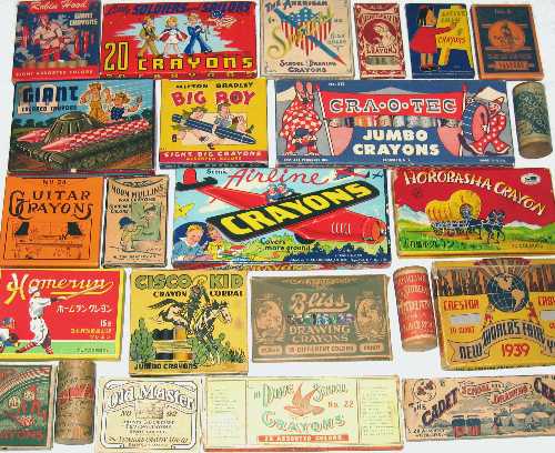
When I started to really accumulate the crayon boxes, I began to do my own research into the questions that came up around crayon history. After visiting the Smithsonian, I quickly realized that my own collection had grown to dwarf any other collection out there. Using a combination of Google Books for periodical research, old catalogs and advertisements from different eras and physical boxes, I was able to put together the pieces of the story of the crayon.


The idea to combine a form of wax with pigment actually goes back thousands of years when the Egyptians and Greeks heated waxes with pigment and used them to decorate warships and the walls of tombs. This encaustic painting art form was difficult to master though as it required a “burning in” process to set the colors.


An old ad for Franklin Manufacturing Company's flagship crayon lines, the Franklin Rainbow Colors Box (American Stationer Vol 38), circa 1895.The modern wax crayon as we know it has its origins coming from both the art world of pastels and the printing world of lithography. It wasn’t until the introduction of Ceresin in 1874 that the true wax crayon industry began to take form. Though this allowed a cost effective solution for crayons, most of the earliest products came from Europe and with poisonous ingredients that prevented them from being considered in schools and for use with children. The kindergarten movement in the late 1800s along with the origins of using paper as a medium to draw upon led to the demand for a safe, non-poisonous coloring medium that would stay on the paper and require little preparation or clean up. Enter the modern day crayon.


Perhaps the original American wax crayon manufacturer was Franklin Mfg. Company out of Rochester, NY. They began operations in 1876 and by 1883 were displaying and selling wax crayons. They introduced the first hard paper tuck crayon boxes that are still used to this day. They were first to introduce the common 8-color and 16-color box sizes. They even put out a 175-crayon box in the 1910s that was eighty years ahead of its time.


Companies like Franklin, Standard Crayon, Prang, Dixon, Milton Bradley and Eagle Pencil all had products in the late 1800s and even American Crayon started producing crayons prior to 1903. Still, that date is important because it marks the introduction of Crayola. Many think that Crayola is synonymous with the introduction of the coloring crayon as we know of it. In actuality, the industry had been building for over twenty years prior to their debut.


Munsell’s Quality Crayons Debut

The label from a box of Munsell Crayons from circa 1906, No. 3 box with 22 colors.At the time of their introduction, Crayola wasn’t even considered the best quality crayon. That distinction went to European crayons and just a few years later to the Munsell Color Company who were not only regarded as the authority on color at the time but also widely recommended for their high quality coloring crayons. Crayola came in and after a few years of dabbling in the market place focused on being the best quality crayon at the least expensive price. They found a niche between the really cheap and disappointing waxy crayons with low quality and the high quality and more expensive Munsell and European offerings. They were able to grow this niche into a global product through an effective branding of their product unseen in the industry. While other manufacturers kept putting out new and different brands and box designs hoping those would catch on with the consumer, Crayola moved their entire product line to their signature yellow and green design. Relatively few products have had such a similar look to their product for over a century and yet still stayed relevant and fresh.


The label from a box of Munsell Perma Pressed crayons, No. 220M with 22 colors.Munsell Color Company’s foray into the crayon industry was a logical output from Albert Munsell’s highly recognized 1905 publication of his scientific work on color notation. What better way to represent Munsell’s color wheel than through a line of color crayons and in 1906 they used Wadsworth Howland & Co to help produce and distribute their own line of Munsell crayons.


By 1924 Crayola had grown large enough that they were looking to expand. They purchased the crayon portion of the Munsell Color Works Company and for a period of time sold two lines of Crayons with the Munsell-Crayola name. There was a molded crayon version called Munsell-Crayola and a pressed crayon version called Munsell-Perma. This acquisition provided two things for Crayola. First, it gave them an instant foot into the higher end marketplace by attaching their name with the one American crayon manufacturer known for very high quality. Second, it provided them with a full spectrum of colors that they would slowly morph into their own crayon color naming and color wheel offerings.


Crayon Colors and the Naming Game

The label from a box of Munsell Crayola crayons, No. 22M with 22 colors.Munsell’s largest crayon color assortment came comprised of 10 maximum and 10 medium color hues (along with Black and White):  MAXIMUM BLACK, MAXIMUM BLUE, MAXIMUM BLUE GREEN, MAXIMUM GREEN, MAXIMUM GREEN YELLOW, MAXIMUM PURPLE, MAXIMUM PURPLE BLUE, MAXIMUM RED, MAXIMUM RED PURPLE, MAXIMUM YELLOW, MAXIMUM YELLOW RED, MIDDLE BLUE, MIDDLE BLUE GREEN, MIDDLE GRAY, MIDDLE GREEN, MIDDLE GREEN YELLOW, MIDDLE PURPLE, MIDDLE PURPLE BLUE, MIDDLE RED, MIDDLE RED PURPLE, MIDDLE YELLOW and MIDDLE YELLOW RED.


By 1930 Crayola had already adopted using Munsell’s color wheel concept into their own color wheel and began producing a separate version of their product that provided all the colors in the color wheel. They also began slowly making the Munsell colors their own by changing names and removing colors that overlapped from what they had to what they had acquired.


A potporri of older crayon boxes from the collection of Ed Welter, crayon collector.In the end, of the original 22 Munsell colors, seven are still available today though under different color names; a testament to the quality and richness of the original colors. And while Munsell practiced a uniformity to their color naming, Crayola has evolved into such a global entity that the very crayon color names themselves generate interest that they’ve been able to capitalize on to generate excitement in the brand and sales for their company. To date, Crayola has produced nearly 300 different unique crayon colors; which probably represent more colors offered up than the entire rest of the crayon industry over its history. But even more astounding is that there are nearly 800 different Crayola color names used for these colors. Many of the basic colors such as Red or Black have numerous crayons with other descriptive color names that associate to that same color because it was renamed for a theme set. Crayola has even used naming contests to generate interest.


All of this color naming has spurned a color collecting niche of its own. Suddenly there were people trying to collect every known color name from a Crayola crayon. And Crayola recognizes this and has put out new colors over the years to appease this market. However, in doing so, we’ve gone from easily interpreted color names to highly subjected ones. The color AWESOME for example would be purely a matter of personal opinion even though they’ve chosen a color family to tie it to. I may find a blue shade of crayon to be awesome but not so for a yellow and you may be the complete opposite. Who’s right?


A shelf filled with old boxes of themed crayons, from Ed Welter's crayon collection.Sharing the Colorful Facts

In the end, I’ve compiled all of this crayon history and shared many of these stories with various publications and through the internet. It would seem like a book on the subject would be my logical choice to create but early on I found that there were too many new discoveries and that a book would quickly be outdated. Instead, I created the Web Site Crayoncollecting.com to catalog crayons, their companies and the stories behind them. The web site is a one person operation and so I am sometimes slow to correct or add new material but as I point out to those that write to me, I’m also the only show in town and I offer up the knowledge and information free of charge and without a single advertisement anywhere. I’m using the internet at its very core intent of allowing quality information to be shared.


With around 3,000 different crayon boxes in my personal collection, I have reached a saturation of both space and acquisitions to pick up. 60,000 crayons in a single room is a smell that will definitely send you back to your childhood as you walk into a floor to ceiling display that takes up every inch of wall space. While all visitors to my collection are astounded with the sheer volume, I think they’re quite surprised to find so many non-Crayola brands that were produced over the years. While I love my sea of yellow and green Crayola boxes and can immerse myself into the minutia of variations and detail, it is the licensed characters and vibrant graphics of the other crayon products that draw the eye as you walk through my collection. With everything from a box depicting Popeye loading a crayon into a surface-to-air missile as support for the WWII war effort, to a box featuring the family of John F. Kennedy during his presidency. As I had intended in my desires for a collectible, the boxes themselves tell the story of America through their graphics that span over 130 years of our history. Despite the fact that I don’t add a lot to the collection these days, I still get the same thrill of a new box of crayons or uncovering a new piece of knowledge to fit into the jigsaw that forms the history of the industry. And I still answer all of the emails sent to me through my web site. I’m rarely stumped with a question.


Ed Welter and family in front of his impressive crayon collection.About the Author

Ed Welter is a collector, crayon historian and author of www.crayoncollecting.com living in Portland, OR with his 3,000 crayon boxes.

Norman Rockwell, Frank J Reilly, Munsell and Me

$
0
0
Painting: After School, by Harold Ransom Stevenson

by Cynthia Bogart

(Featured image, left: “After School”  by Harold Ransom Stevenson)

In my previous life, I was a professional artist, classically trained. Even though I am not currently practicing doesn’t mean that the training I received is all for naught. I can honestly say it has made me better at so many things ranging from being a more intuitive journalist to decorating my home.

I owe my training to Harold Ransom Stevenson, founder and teacher of The Stevenson Academy of Renaissance Art, which later was renamed, The Stevenson Academy of Traditional Painting, along with his wife, Alma Gallanos Stevenson, a former Art Director for Colgate turned Impressionist-Realist. Mantra #1 at the studio was:

“To be an artist takes one percent talent and ninety-nine percent hard work”.

Part of that hard work was learning how to see. You’ve heard of artists who paint with their toes or with a paint brush welded from their teeth. They can paint because of what’s in their head not their hand.

Learning the Renaissance Method of Painting

Drawing of a sphere from RachelCarter.ca showing highlight, mid tone, core shadow, reflected light and cast shadow.

Courtesy of RachelCarter.ca, Classical Fine Artist

As a young man straight off the front lines of World War II, Harold Stevenson was able to get his name into consideration when Norman Rockwell decided to select five vets to apprentice with him in his Vermont art studio in 1946. This pivotal tipping point set Stevenson up in career as an illustrator, artist and teacher. The lessons learned in Rockwell’s studio – predominantly drawing, structure and composition – have been passed forward to the hundreds of students that filtered through the doors of The Stevenson Academy of Renaissance Art.

Like Rockwell, Stevenson started his students off learning technical skills, he didn’t initially teach ‘technique’ – that came later. This was a traditional Renaissance method taught as any other trade was taught. Carpenters, Jewelers, artisans, silversmiths – they all learned their skills and served apprenticeships, as did the artist.

The method of learning how to draw was straight forward. The student started drawing the basics: circles, cones and rectangles, which when put together make up all images in life. To those shapes this method was applied, one that will be ingrained in my head and any other student of Harold Stevenson’s forever:

The principles of creating a form on paper, or canvas is to use values from light to dark to reflected light to cast shadow.

Painting by Frank J Reilly, Artist, Illustrator & Teacher - Philadelphia Blended Whiskey (1947)

Frank J Reilly, Artist, Illustrator & Teacher

However, it was when Stevenson went on to study with Frank J. Reilly at the Art Student’s League in New York City that he learned the method of separating color into hue, value and chroma; the method devised by artist/scientist Albert Munsell who established the Munsell Color System. Any student attending Art school should be familiar with the system, but Reilly made his students use the system in practice. In turn, Stevenson made his students use the system in practice.

The Practical Use of the Munsell Color System

The Reilly Munsell Palette from ThinkingAboutPainting.blogspot.com

The Reilly Munsell Palette

The Munsell system was methodical and developed one’s sense in differentiating values and hues quickly. For flesh tones, neatly ordered rows were built to match the initial line of gray – 10 values from black to white; then a row of ocher/raw umber, raw sienna, burnt umber and cadmium red were added and matched in value. A secret to ‘seeing’ the relationships between colors was to squint.

Painting with colors ordered on the palate using the Munsell system gives consistency in the mood or tone of a painting; takes the guess work out of re-mixing colors, and enables the artist to fully focus on the creative aspects of the work at hand.

Being an artist is a gift. However, without the technical skills and education on how to execute your work, it will be nothing short of frustrating. Whether your painting style is realistic, abstract or anything in between, color – hues, values and chroma – is key. Munsell is a scientific tool that when learned and used makes the art of being an artist so much easier.

About the Author

Cynthia Bogart, regional magazine editor for Better Homes & Gardens Magazines and founder of The Daily Basics.com.Cynthia Bogart is an 18 year regional magazine editor for Better Homes & Gardens Magazines. She founded the website, The Daily Basics.com, a lifestyle website focusing on home, food and travel in 2010. Prior to that, she was a professional artist. She had one-man show gallery exhibitions in New York; was a muralist, had a series of fine art prints commissioned and was a table top designer. A transplanted New Yorker, Cynthia and her family live in Rhode Island.
Google Plus:  TheDailyBasics
Follow her on Twitter: @thedailybasics
Facebook:  TheDailyBasics
Pinterest:   The Daily Basics

Fifty-five Years Using the Munsell Color System

$
0
0
A selection of beautifully hand knitted colored scarves at the Blackberry Bear booth at the Fountain Hills art and craft show.

By Priscilla Palmer

I was introduced to the Munsell Color System in 1958-59 while a freshman student at U.C.L.A.

I still have the booklet we were given in class:  A Practical Description of the Munsell Color System and Suggestions for its Use, copyright revised edition 1937 by T. M. Cleland. It is not an exaggeration to say that the Munsell Color System has had a profound impact on my life. After spending two years at U.C.L.A., I changed directions, married the man of my dreams, and began putting the color system into practice.

Priscilla Palmer's (nee: Beech) 1960 UCLA yearbook photo, where she learned about the Munsell Color System that would guide her in her future careers.Over these many years, I have decorated over thirty homes. Some were our family homes; some were the homes of neighbors, relatives, and friends. All were accomplished by using the Munsell Color System as a guide. I copied the Munsell Student Chart, had it laminated, and carried it with me when shopping for upholstery and curtain fabrics, wallpaper, and coordinating paints.

As my daughters grew, I taught them how to use the color chart. I tried with my sons, but wasn’t too successful at that.

Years on, I returned to finish college and found to my amazement that the Munsell Color System was still being taught. I graduated from California State University at Los Angeles with a degree in Art. I worked for a production company at Warner Bros. I started my own literary agency, Oracle Associates LLC. I write and art direct children’s picture books.


Blackberry Bear's booth at the outdoor art and craft show, The Fountain Hills, AZ, Great Fair, which draws 250,000 to 300,000 fairgoers annually, one of the largest in the Southwest.

Wearable Art and Yarn for Sale

My oldest daughter, Nancy, and I design and construct wearable art in the form of hand knitted and crocheted clothing fashions. We call our shop Blackberry Bear, and online at Blackberrybear.etsy.com. Since 1981, we have gained acclaim by word of mouth for our creations which have adorned minister’s wives to movie stars. But what sets our garments and yarn products apart is the way we use color. In entering our shop, a customer will stand astounded–taking in the gorgeous array of garments before them. “What beautiful colors!” they exclaim. “I’ve never seen anything like this before.”  One woman said she had not seen anything like our yarn combinations since she visited Geneva and Paris. We took that as a high compliment.


Designer hand knitted wearable art - the Mezza Luna Wrap, sold by Blackberry Bear on Etsy.

We are happy to explain whenever anyone asks that our artistic choices are informed by the Munsell Color System with its unique theory of hue, chroma, and value.

Designer knitting yarn cakes for sale by Blackberry Bear yarn shop on Etsy.


About the Author:

Priscilla Mary Palmer (nee: Beech) is a literary agent, children’s book author, artist, talented colorist, and hand weaver with the rare talent of perfect color ‘pitch’. She is passionate about preserving and passing on knowledge and hand work skills to the next generation of knitters and crocheters, as well as children’s stories and history. She earned her BA from California State University, Los Angeles in Art, specialty Art History, 1994. She runs her own literary agency, Oracle Associates LLC and is a member of the Society of Children’s Book Writers and Illustrators. She has discovered and represented several authors of note, including National Book Award and Los Angeles Times Book Prize finalist Adam Bagdasarian, for his novel Forgotten Fire. When Priscilla is not writing her next children’s book, illustrating her own work, or representing her author and artist clients, she can be found knitting up new designs for Blackberry Bear for the next show!

A Color Wheel for Quilting and Fiber Arts

$
0
0
Hand dyed basics fabrics by Vicki Welsh, based on the Munsell Color Wheel.

I have always made things. From my earliest memories the only gifts I ever wanted were fabrics and craft supplies. I was never encouraged to take art classes because I was a crafter, not an artist so I missed out on any formal training in how to see and use color.

Using Color Theory in Fiber Art

For years I made my own clothes and in the mid 1990’s I discovered quilting. Color was easy with clothing. I mostly made suits and office wear so black and blue made up the majority of my palette. When I switched to quilting, color became a huge challenge. I had no idea how to pick colors for my quilts and mostly relied on the fabric manufacturers to pick fabrics. I eventually had an opportunity to take a a class called Color Theory for Quilters. It was an all-day class and I could not figure out how the instructor was going to be able to fill an entire day talking about color.

Was I ever surprised! When I was telling a friend about the class my comment was “I need at least 5 more all-day classes to even get started understanding color.” It was like a first taste of chocolate. I walked out of that class wide-eyed and energized and completely overwhelmed about all the other things that I knew I needed to know. That one class over 15 years ago started me on a great journey to study color.

I followed that class a few years later with a 2-day value class with Hollis Chatelaine and have since read over 12 books on the subject.

 Color theory fabric dyeing - Gradient Red Sunset by Vicki Welsh

Which Color Wheel Chart?

I became a little obsessed with understanding all of the different color systems and eventually started to understand the Subtractive, Additive and Partitive (Munsell) systems and how each is used.

Unfortunately in the quilt industry we are primarily being taught to use a Subtractive system based on the Ives Process Wheel. The author of the quilt books and tools in using this system says that the Process wheel is the right wheel for textile artists because it is the wheel used by manufacturers that print fabrics. That made no sense to me.

At the same time I started dyeing fabric and blending my own colors. I started to understand within my own work the difference between systems for color mixing and systems for perceiving color. I plan my fabric palettes using the Munsell system.

Hand dyed fabric by Vicki Welsh, using the Munsell Color System for color palettes.

I found the New Munsell Student Color Set and was surprised to discover that the author, Jim Long, resided right here in Richmond, VA at that time. He is the retired Chair of the Film and Photography Department at Virginia Commonwealth University. I found his email address to ask where to find his book. That led to a few email exchanges. I eventually had to explain why this random person was so interested in color theory – a topic that he says most artists aren’t interested in at all! I told him about my background and the root of my interest (proclamations about there being only one right color system) and my conclusion that there are several that are right for different uses but that for fiber artists I felt that the Munsell system was most appropriate. Here’s what he had to say on that:

“Color theory can get a bit sticky because there are several systems. Regarding color wheels it is important to recognize that there are different types. The Munsell color wheel is based on human perception, NOT paint mixing. Artist color wheels generally are based on paint mixing, although pigments of the same color but different chemical composition will mix differently. ”  – Jim Long

In my mind, that validated my own research and that’s why I primarily use the Munsell color system when I am making quilts and creating color palettes for my hand dyed fabric.

Hand dyed basics fabrics by Vicki Welsh, based on the Munsell Color Wheel.

I now have a popular set of fabrics based on the 10-step Munsell Color Wheel.

About the Author

Vicki WelshVicki Welsh is a retired insurance executive who now works full time dyeing fabrics and experimenting with color through quilts. You can see her work on her blog, Field Trips In Fiber and see her fabrics in her shop.


Color Flow Exercises: Mixing, Blends & Scales with Maggie Maggio

$
0
0
A Munsell Hue 5PB chart and polymer clay demonstrating various color flow exercises

No matter your medium, color flow studies are a great way to get a better understanding of the three properties of color. Over the years, I’ve taught color flow exercises in paint, dyes, inks, and, my personal favorite, polymer clay. An ideal medium for color flow exercises, polymer clay comes in many colors, can be accurately measured, is easy to clean up, and, best of all, it is color you can hold in your hand. 

Artists have mixed colors in pigments for millennia, but it’s only been in the last ten years or so that we’ve had the widespread ability to play with mixing color in light. Now that there are computers that you can also hold in your hand, I am starting to integrate studies in light into my workshops.

Three Directions of Color Flow

Munsell clearly ordered colors in relationship to each other as they flow from one to the next.

This is a pencil sketch I made when I started teaching color workshops twenty years ago. It was based on what I learned from the Munsell system in college. I call it the Tilted Equator.

In many three-dimensional color spaces, the hue circle is shown running horizontally around the middle of a sphere as if it were an equator. This positioning implies that all the hues on the circle are in the same middle value position between black and white.

A diagram showing the three dimensions of color for Munsell

In the Tilted Equator diagram, the hue circle is positioned on a diagonal to show how each hue changes in value as it flows along the circle. Blues are closer to black and yellows are closer to white. This diagram also shows how colors can be shifted in three dimensions by tinting, by shading, and by moving “underground” below the surface of the sphere toward the center axis.

Types of Color Flow Exercises

There are many different directions to go in exploring color flows.

  • Value Flows: Color to White/Light, Color to Black/Dark
  • Hue Flows:  Primary Color to Primary Color
  • Saturation/Chroma Flows: Color to Complement, Color to Neutral

Regardless of the medium, all colors have specific attributes that affect how they mix with other colors. The two most important characteristics are tinting strength and hue bias.

Tinting strength is used in the subtractive system to define the pigment power in relation to the amount of paint, dye, ink or polymer. Some colors are bullies and some are wimps. It’s useful to know the tinting strength so that you can figure out the comparative proportions to use when mixing.

Since there is no such thing as a pure primary color, hue bias defines a color’s relationship to one side or the other of a theoretical pure primary on the hue circle; some yellows lean more toward green and some more toward orange. This is important information since the hue bias determines whether or not a third primary is present in a mix. It’s helpful to know the hue bias of colors since the presence of a third primary adds “mud” in the subtractive system, and adds light in the additive system.

The best way to learn color mixing is to practice with color flows. In the process of exploring color flows, you naturally learn about the tinting strength and hue bias of each color you test.

Four Color Flow Exercises

Here are four different exercises that give students hands-on experience in mixing the first type of color flow: a value flow that runs from a pure color to white. Three of the exercises use polymer clay and one uses the computer.

1. Color Scales

The most common way to study color flow is through color scales. Color scales run in a step-by-step sequence from one color to another. The exercise of making color scales is similar to warming up by playing music scales. The principles of color mixing are internalized during the process of routine practice.

Color scales can be mixed in many different directions. Below is an example of a tinting scale from white to ultramarine blue.

A color flow study scale showing circles of color from white to deep blue

Although you can mix the color flows intuitively, the steps in color scales are usually measured and documented. There are two different ways to do color scales—arithmetically and geometrically. I prefer to use the geometric method because the process allows you to mix colors in smaller and smaller proportions until the mixed colors are close to the colors at the ends of the scale.

2. Step Blends

The colors in a step blend are mixed separately and then combined to create the illusion of a color flow. Faster than color scales, the formulas for each mix do not need to be accurately measured. Below, I’ve shown a quick way to determine the proportions for each step.

A color blend from white to deep blue showing steps to create the blend

3. Skinner Blends

Invented by Judith Skinner in the early 1990s, the Skinner blend is a way to mix a color flow that blends seamlessly from one color to another. The easiest way to make a Skinner blend is to use a pasta machine but you can also make a blend using a rolling pin or brayer to sheet the clay.

Start by sheeting a triangle of white and one of blue. Arrange them in a square as shown below. Fold the square in half keeping the white on one side and the blue on the other side.  Run this double thick sheet through the pasta machine – or flatten with a roller – to make it a single thickness again.  Keep folding the sheet in half and rolling it thin until the colors merge into a smooth blend.

A 4-step diagram showing a skinner blend using a press

4. Computer Scales

Exploring how color works on the computer is helpful even if you are not doing digital designs. If you have access to Illustrator or Photoshop programs, then you can create a color scale very easily. If you don’t, then you can use a word processing program.

Open a word processing document and create a row of six text boxes. Fill one of the end boxes with your first color, and the other end box with your second color; do this by using the custom color picker in whichever program you are using. Then play with the hex codes to find the colors that go in between.

Blue color scales using a computer and generating hex codes

The six-place hex code is divided into three parts—two spots each for red, green, and blue. There are sixteen possible identifiers that can go in each spot—the numbers from 0 to 9, followed by the letters A to F. The highest code in RGB is FFFFFF, which equals white. The lowest code is 000000, which equals zero light in red, zero in green, and zero in blue. Zero light equals black.

Label the boxes with the corresponding hex code to learn the ordering concept behind the numbers and letters. Be sure to print the results. The colors on the screen and the colors that are printed are often not the same. But that’s a whole different post!

Summary

The color flows that result from mixing colors in pigment and light follow pathways laid out by Munsell over one hundred years ago.  A word of warning: Mixing color flows can be addictive. Once you start seeing all the variations of color you can create, you may find yourself mixing more colors rather than working. But don’t worry. I have found that the process of exploring how colors flow gives you hands-on experience that can help take your work to a whole new level.

This is the first in a series of posts about exploring colors flows. The next article will compare the color flows of the partitive Munsell system with color flows in the subtractive and additive system.

About the Author

Maggie Maggio uses polymer clay to teach “Smashing Color” workshops around the world. The polymer exercises above can be found in her book, co-authored with Lindly Haunani, Polymer Clay Color Inspirations, published by Watson-Guptill/Random House in 2009.

TRAC 2014: Graydon Parrish Explains the Munsell Color System

$
0
0
Graydon Parrish and Steve Linberg, presenting The Munsell Color System for Artists at the Representational Art Conference, TRAC 2014.

In early March, 2014, over 300 people in the art world came to Ventura, California to attend the Representational Art Conference, also known as TRAC 2014. It’s an international gathering of those interested in exploring “representational art’s place in the 21st Century.” Artist Graydon Parrish, along with co-presenter Steve Linberg, presented a studio demonstration named “The Munsell Color System for Artists” to a standing room only audience. We interviewed Graydon Parrish to learn more about his presentation.

The approximately 150 people who attended the session were predominantly artists, with perhaps 25% consisting of other people in the art world, such as gallery owners, art scholars and philosophers. Most had heard of the Munsell Color Order System and were curious about it, but hadn’t learned how to apply it specifically to painting. ­

Banner for The Representational Art Conference - TRAC 2014.Parrish and Linberg donned white lab coats and performed a “Bill Nye the Science Guy” schtick, playing off of each other with Parrish being the “art guy” and Linberg acting as the “theory guy”. Knowing that some painters prefer to run the other way when confronted with math, Parrish intended the fun session to reduce their apprehension and explain that Munsell is a color ordering system, and that the “hue value/chroma” notation used does not mean that long division is involved! After an introduction to Munsell color theory, how the theory can be applied to painting was explored with subjects such as problems working with pigments, counteracting hue shifts and the three dimensional aspects of color. Parrish mentioned famous works of art that seem somewhat mysterious, like that of William-Adolphe Bouguereau and explained that they’re mysterious because most people don’t understand hue and chroma. The chips from the Munsell Book of Color can be used to solve those mysteries and produce identical matches. Painting flesh colors can be understood much easier when looked at as a cross section of low chroma yellows and reds.

Artists Steve Linberg and Graydon Parrish, at their presentation of The Munsell Color System for Artists at TRAC 2014.Parrish said they received lots of great feedback and that the presentation helped to dispel some of the confusion and misconceptions about color theory, turning it from what seemed like intimidating science to a useful tool painters can apply to their art. Color theory is clearly useful for representational art, and since colors in nature are predominately low chroma, Munsell color notation helps to understand colors needed in realistic paintings that you can’t typically give names to. Despite being known for realism, Parrish also said he has a fantasy about teaching color theory in an abstract painting class, and how exciting the possibilities with color and design can be in abstract works.

Graydon Parrish, realist painter, with the Munsell Book of ColorGraydon Parrish is a realist painter living in Austin, Texas and is an instructor at the Grand Central Academy of Art. Graydon is both trained in and an exponent of the atelier method which emphasizes classical painting techniques and has remodeled color theories by Albert Munsell and Josef Albers to fit traditional painting methods. Parrish has lectured at the Clark Art Institute, the University of Hartford, the Austin Museum of Art and the Santa Barbara Museum of Art. His work is displayed in public collections including the New Britain Museum of American Art, the Butler Art Institute and the Blanton Museum of Art as well as the personal collections of Michael Huffington, Christopher Forbes and Carmen Dell’Orefice.

Creating Pixel Art Using Color Theory

$
0
0
Alex Hanson-White's finished example of a chimpanzee illustration, creating Pixel Art using Munsell Color Theory.

When I try to depict natural tones and colors in my art, the Munsell Color system illustrates how my choices work. The system incorporates the main components that are identified when using color, and organizes these into a sensible three dimensional graph that anyone can look at and understand. Any color can be broken down into these components and playing with these allow me to traverse the entire spectrum to find exactly what I feel is suitable for use within any image I create.

Applying Value, Hue and Chroma

The Munsell Color system deals with the value, which corresponds to the concept of the amount of light or darkness your eyes see. It deals with the hue, which corresponds to the wavelength of light you see. It also deals with the chroma, which is the level of saturation with that wavelength. These act as a foundation for representing color, and along with my interpretation skills, when I observe what I do, I can choose the balances that are appropriate for any situation so that the results feel as natural or unnatural as I want them to be. This is a mental exercise that strengthens not only my visualizing abilities, but my ability to comprehend the reality of those visuals.

For instance, if I am to create a portrait utilizing my pixel-art style, I would involve myself with several choices that would affect the final outcome of the image. There would be many ways to conceptualize every stage of the process, and by picking the most appropriate task at each moment, depending upon my mood, and fitting it with everything else I have done or plan to do, I would be able to construct what I envision. Whatever gets me to my next step is a valid approach, which could involve working with values, working with hue, spatial relations, patterns, and many more.

Usually when I am to draw something in which I could reference (something outside my mind), such as a photo of a talented chimp, I will look at the positive and negative shapes that I can visualize within it in order to find a way to anchor myself to the project I’m about to embark on. In other words, I find a way to create a foundation for all the future stages to work off of. This could involve sketching out the edges where I see those spaces to be, or filling broader areas of those spaces in. I would use a color that contrasts well with the background or at least suits the space it will represent.

Alex Hanson-White's chimp example outline for creating Pixel Art using Munsell Color Theory.

The core of the Munsell system is value, and often this is the easiest characteristic of light to work with as an artist. Most artists start out utilizing this scale primarily before incorporating the other characteristics of light – due to the dualistic nature of it – that is easy to grasp the polarity between light and dark. As with anything that involves more than one characteristic, it is easier to approach them one at a time in order to learn how to use each precisely in your art and understand how a characteristic reacts to your changes. In this way, I’ve developed my grasp upon these aspects of light that the Munsell system illustrates, and with it I can use it in the process of my work like an instrument to convey whatever emotion I want these elements to exude. Color can feel warm, cool or something neutral in between. Similar to the way temperatures affect physical objects, light with its varying wavelengths act upon our psyche. We can feel excited or calmed and depending upon the context we find ourselves in during the moment, they can sway our emotions towards whatever we empathize with. By using color in my art, I have the opportunity to play with these effects and learn more about their influence.

Value and hue are easier for most people to grasp than the concept of chroma. The Chroma scale acts like a bridge between the two. A way of describing it is as if you superimpose hue over value so that they blend together. You have a neutral gray value that can become infused with color. A gray reflects a balance of wavelengths from visible light into your eyes so that no single wavelength overpowers another, but any slight alteration to the balance so that one wavelength become more or less prominent will produce a preference in your eyes and mind to a point where you’ll begin to see a color emerge. The Chroma scale maps out these slight increases and decreases of color saturation allowing you to measure how vague or pronounced hue can be. In the process of creating art, these varying degrees of color saturation help spice up the image and stimulate your senses in interesting ways. Like mentioned before, color can affect your emotions, and by varying the Chroma, you can alter how drastic or subdued these effects can be.

Alex Hanson-White's chimp example for creating Pixel Art using Munsell Color Theory.

Swinging the Munsell Hammer

Every step involves something different, a slight change from what was previously focused on, while continuing to take into regard the entire picture. It’s not necessarily a calculated act as you would imagine a mathematical problem, but rather more like a dance with strangers you don’t know- an investigation of some sort that you’re unraveling. It may be uncomfortable or strange, but in the process you are finding out what feels good. The Munsell Color system acts as one of my tools at my disposal, allowing me to deal with that strange phenomenon we refer to as color. While the Munsell Color system has a precise function, it isn’t something I over think. You can wield a hammer, and all you have to do is swing it towards whatever you want to hit. You can’t teach someone how to swing it. You can show them and maybe they’ll find a way to reproduce the way you swung it, and with that they’ll have taught themselves. Likewise, the Munsell System is that hammer, a device you can grip with your mind and swing your focus towards the colors you want to hit. How you choose to swing it however is something you decide for yourself. You can choose to progressively move throughout the scales of value, hue, and chroma and in doing so produce a more natural feel, or find a more erratic path that feels more striking and imaginative.

Alex Hanson-White's finished example of a chimpanzee illustration, creating Pixel Art using Munsell Color Theory.

It’s difficult when you learn to use any new instrument or language, but with practice it all becomes a natural extension of the body, an extension of everything you’re involved in because your involvement with it is within everything that you do. That’s the way it has to be, otherwise you wouldn’t be handling it, and it would escape you. The Munsell system defines these handles that allow you to connect with the qualities of color the way I do.

Working with color can be a very personalized process that is self reflected in its application of it. How you feel in the moment can influence your color choices, and also they can influence how you felt when you chose them. There’s no wrong way to it if the colors move you the way you’ll do it.


About the Author

Alex Hanson-White, Pixel artist.Alex Hanson-White began creating art from a very young age, and spent all his life devoted to his creativity. He is self-taught, and pursues various dreams for the sake of hopefully making something unprecedented. Alex spends time programming games, as well as creating pixel art graphics for others who make video games. He enjoys the story-telling possibilities of games and has also written and self-published a book about art and perception. The book describes how the changes you sense around you can be relied upon when interpreting the world and that there aren’t any illusions except your own that you hold because everything you sense has a purpose and message from which it came. You can view more of his work here: http://www.alexhw.com/.

Continua: Phone Books, Mapping Color and the Munsell Color Tree

$
0
0
Katie Murken's art installation, Continua, based on the Munsell Color Tree.

My enchantment with the color continuum began during my tenure as a Foundations instructor at Tyler School of Art, where the traditional color wheel still lies at the heart of the study and application of color theory. Over the course of several years I studied various models of color theory and developed exercises and projects to help my students understand the complex relationships between colors and the importance of color to the meaning and message conveyed in a work of art or design.

One day when I was digging around in the department’s storage closet I came across an old Munsell Color Tree. This was the first model I had seen that diagrammed the attributes of color in three dimensions and I was intrigued by the idea that the vast world of color could be described spatially in the form of a sphere. My creative work is often influenced by my teaching, and the seed was planted for a personal exploration of the relationship between color and space that would keep me occupied for the next several years.

Close up view of the hand-dyed telephone books used in Katie Murken's art installation, Continua.Mapping Color in Space

Continua is a walk-in environment that resembles the Munsell Color Tree in the sense that it maps colors through space rather than across a two-dimensional surface. In my project the swatches become individual layers in a series of floor to ceiling columns crafted from salvaged telephone books. Over 900 individual books were methodically deconstructed into smaller sections according to the proportions contained in the page-numbering system. The sections were then hand-dyed and stacked according to a self-designed color formula. The piece models geologic process in many ways and shows a slow modulation of color through the sedimentary layering of sheets of colored paper. Each column consists of approximately 30,000 individual sheets! The telephone books become a terrain for the mapping of color – exerting their own tones, textures, and ordering system on the outcome of the piece.

Dyes chosen to color salvaged telephone books for Katie Murken's art installation, Continua.

Sections of hand-dyed and stacked salvaged telphone books drying during the construction of Katie Murken's art installation, Continua.

Building a Color Wheel

David Batchelor, in his book Chromophobia, distinguishes the analogical color wheel from the ubiquitous digital color chart. “Analogical colour is a continuum, a seamless spectrum, and undivided whole, a merging of one colour into another. Digital colour is individuated; it comes in discrete units; there is no mergence or modulation; there are only boundaries, steps and edges.”  It is precisely this modulation of the color spectrum that I manipulate in my concept for Continua.

Building color charts for Katie Murken's artwork, Continua, based on the Munsell Color Tree.

Color wheel chart for Katie Murken's art installation, Continua, based on the Munsell Color Tree.For each of the 24 columns in the installation a unique scale of 24 colors is produced from the mixing of three original hues – or a triad of colors. These color scales were used as a game board from which colors are selected according to the roll of two dice. The game relies on a set of probabilities, which are designed to favor the slow and nuanced transition from one color to another, yet allow for the occasional juxtaposition of contrasting colors. The system allowed me to incorporate color harmony, geometry and chance, resulting in a rhythmic yet unpredictable score of endlessly modulating color. Each of the 24 color continua produced in this process are arranged around the perimeter of an octagonal room, which is succeeded by a gallery of diagrammatic broadsides depicting the theoretical mechanics behind the project.

Katie Murken's artwork, Continua, used color scales as a game board from which colors are selected according to the roll of two dice.

For more information about Continua, see:

Katie Murken's art installation, Continua, based on the Munsell Color Tree.

About the Author

Artist Katie Murken, her work, Continua, inspired by the Munsell Color Tree.Trained as a printmaker and book artist, Katie Murken creates site-specific installations that position her hand-made objects, books and drawings in relationship to diverse environments and audiences. Murken has shown her work regionally and nationally, including exhibitions at Grounds for Sculpture in Hamilton, New Jersey; The Soap Factory, Minneapolis; The Contemporary Arts Center, Las Vegas; The Print Center in Philadelphia; The Pittsburgh Center for the Arts; and the 23 Sandy Gallery in Portland, Oregon. Her work is included in the collections of The Free Library of Philadelphia, William Paterson University, New Jersey, Temple University Library in Philadelphia, PA and the J. Edgar Louise S. Monroe Library in New Orleans, LA.

The Importance of Color Theory in Painting

$
0
0
Aimee Erickson's painting, "Sarah", awarded Best of Show at the 2014 American Women Artists national Juried Exhibition.

Color Theory was a required foundations course in the Visual Communication Design program at BYU, so all the design students took it–the interior designers, graphic designers, industrial designers, and the illustrators. That last group included me. I had grown up in Silicon Valley and never heard of art school, so when I found out you could get a degree by taking drawing and design classes I was thrilled and slightly suspicious, and signed up immediately.

I remember going to the campus bookstore and buying the mysterious and costly “Munsell student kit,’ which was the first assignment we did in class. We all sorted those lovely little color chips with our brand new No. 11 X-acto blades and the grammar of hue, value, and chroma was explained. I had been one of those kids who always sorted my crayons by color (rainbow order, of course). Now after 20 years as a freelance artist, I still have my student charts and I still think about color every day. I think the question I’ve most asked myself throughout my life is “How would I mix that color?”

Image of Aimee Erickson's Hue, Value and Chroma chart, the first chart we do after value scales. Also included is Aimee Erickson's college textbook, and a worksheet manipulating value and chroma for a single hue.

Hue, Value, and Chroma is the first chart we do after value scales. On the left is my college textbook and on the right is a worksheet manipulating value and chroma for a single hue.

I started teaching painting and drawing classes to adults about ten years ago. Adults who simply sign up for a painting class and did not go through the foundations program seemed to me to be at a distinct disadvantage. I decided to teach a color theory class for painters. I recreated the Munsell charts, larger this time, and adjusted for oil painting. I’ve taught this class for several years now and have developed an entire curriculum with worksheets and assignments.

Why Study Color Theory?

The principles are simple to understand, but in painting, they are pretty darn complicated in practice. As the saying goes, “If painting were easy, lots of people would be doing it.” In math we learn first to count, then to add and subtract, and eventually we get to calculus. If we use that as a metaphor, we could say portraiture is trigonometry and color theory is arithmetic.

Yellow paint with various blue paint patches underneath - part of Aimee Erickson's test to see which blue value best matches the value of this yellow.

Testing to see which value best matches the value of this yellow. It helps to bracket by intentionally going too light and too dark.

Students often think they just don’t have an eye for color because they’ve been attempting things way beyond their skills, but when the exercise is an abstract one, just one color next to another (instead of a representative image and all the complications that introduces), they easily learn to see more. The class also allows students to become familiar with the medium because so much time is spent laying out paint, making mixtures and adjusting them, and laying down paint. Many students have come back from doing chart after chart of colors and said that it’s a very Zen experience. I’ve felt that too. Value scales are like a meditation for me.

Side by side images of cadmium red light paint next to gray colors. Shown in color, then desaturated to see if values are about the same.

Left: Testing my best guess at finding a gray that is the same value as cadmium red light. This is one of the more difficult things to see because a high-chroma color feels so much more lit than a gray.
Right: The same photo, desaturated, shows that the values are about the same. The sheen makes it a little hard to tell, but close enough is close enough!

I’ve come to wish that color theory was a standard curriculum for third graders. Color is such a basic part of our lives and having a vocabulary for seeing it gives us a richer visual experience.

Aimee Erickson's painting, "Sarah", awarded Best of Show at the 2014 American Women Artists national Juried Exhibition.

In practice, we can make an object feel more lit by making it lighter than the shadow side, but with enough color that it doesn’t look bleached out.
Aimee Erickson’s painting “Sarah” was awarded Best of Show at the 2014 American Women Artists national Juried Exhibition.


About the Author

Aimee Erickson with her work, "Self Portrait with Key" awarded the Award of Excellence for Portraiture at the Oil Painters of America National Exhibition in 2014.
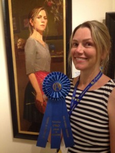
Aimee Erickson graduated from Brigham Young University with a BFA in Illustration in 1991. Now an award-winning fine artist, she has been painting professionally for 25 years as well as teaching art classes, painting murals, and doing architectural color consulting. She lives in Portland, Oregon.
www.aimeeerickson.com

Viewing all 45 articles
Browse latest View live


<script src="https://jsc.adskeeper.com/r/s/rssing.com.1596347.js" async> </script>